Eclipse Travel
less is more

The Brief.
To give a travel agent an inviting logo and travel magazine, that would engage customers and keep them interested with easliy read information.
Branding Design.
Both the logo and business cards are super simple and modern with bright eye catching colours that pecks consumer interest and brings in passing customers.
Print Design.
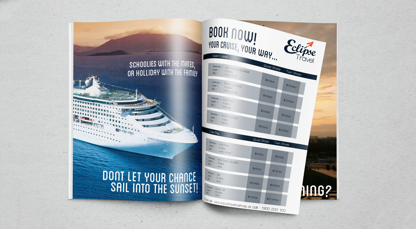
The Magazine was based around the idea, of showing the audience what they could have and then showing them how to get it all at a simple glance of the pages.

Copyright © 2014